Matplot is a very powerful python library to visualize the datasets. It is built upon the SciPy and the NumPy library.
Further, it would be better to give examples that make you understand the matplot library.
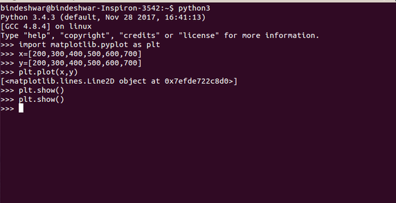
Example-1
import matplotlib.pyplot as plt
x=[200,300,400,500,600,700]
y=[200,300,400,500,600,700]
plt.plot(x,y)
plt.show()
Execution on ubuntu
The output of the code will be.
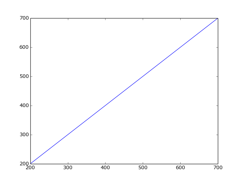
You can observe that there are not any x-axis and y-axis labels. Further, to add these labels you have to use xlabel and ylabel functions. Then the program will be
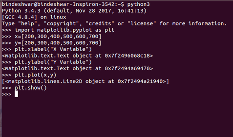
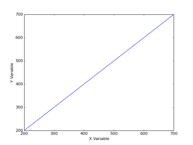
Example-2
import matplotlib.pyplot as plt
x=[200,300,400,500,600,700]
y=[200,300,400,500,600,700]
plt.xlabel(“X Variable”)
plt.ylabel(“Y Variable”)
plt.plot(x,y)
plt.show()
Command line execution of the program on Ubuntu
The output of the program would be
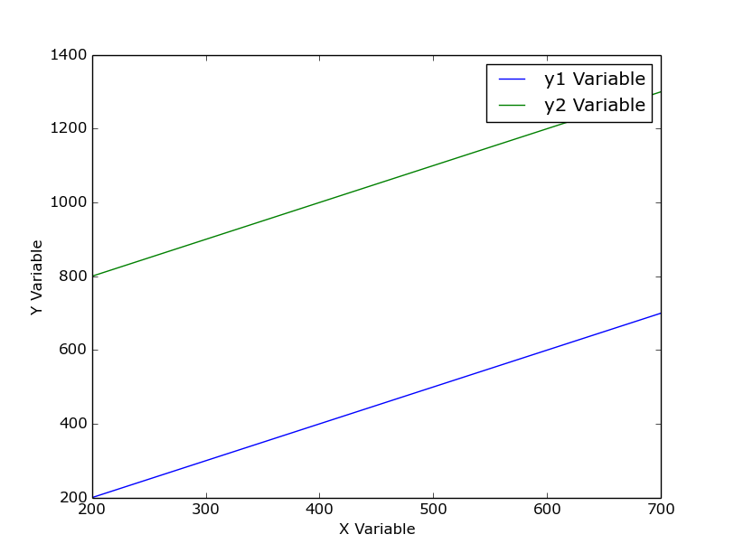
Plotting Two Lines
import matplotlib.pyplot as plt
x=[200,300,400,500,600,700]
y1=[200,300,400,500,600,700]
y2=[800, 900,1000,1100,1200,1300]
plt.xlabel(“X Variable”)
plt.ylabel(“Y Variable”)
plt.plot(x,y1, label=”y1 Variable”)
plt.plot(x,y2, label=”y2 Variable” )
plt.legend()
plt.show()
The output of the code would be
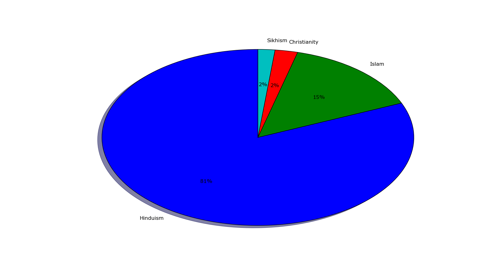
Pie Chart in Matplotlib
import matplotlib.pyplot as plt
labels= ‘Hinduism’, ‘Islam’, ‘Christianity’, ‘Sikhism’
data = [79.80, 14.23,2.30,1.72]
c= [‘red’, ‘green’, ‘yellow’, ‘white’]
e=(0.0, 0.0, 0.0, 0.0)
plt.pie(data, explode=e, labels=labels, autopct=’%0.0f%%’, shadow=True, startangle=90)
plt.show()
Output of the program would be