Understanding Speech Data using Python
Author: Bindeshwar Singh Kushwaha – Postnetwork Academy
Introduction
Speech is a continuous acoustic signal that we digitize so computers can analyze and learn from it.
This post walks you through what speech data is, how to load and visualize it in Python using librosa,
and why both time-domain and frequency-domain views matter. You’ll see a minimal, reproducible example and a quick visual guide.
For reference, duration is simply \(T=\frac{N}{f_s}\) where \(N\) is the number of samples and \(f_s\) is the sampling rate.
What is Speech Data?
- Definition: Audio recordings containing human voice signals, stored as a sequence of sample amplitudes over time.
- Two Main Forms:
- Time-Domain: Waveform showing amplitude vs. time.
- Frequency-Domain: Spectrogram showing energy distributed across frequencies vs. time.
- Why Process Speech Data?
- Speech recognition (transcription)
- Keyword/command detection
- Speaker identification and emotion detection
Loading and Displaying Speech Data in Librosa
Python Example
import librosa
import librosa.display
import matplotlib.pyplot as plt

# Load the speech audio file at its native sampling rate
y, sr = librosa.load("stop.wav", sr=None)

# Display basic information
print(f"Sample rate: {sr} Hz")
print(f"Audio length: {len(y)/sr:.2f} seconds")

# Plot the waveform
plt.figure(figsize=(8, 3))
librosa.display.waveshow(y, sr=sr)
plt.title("Speech Waveform")
plt.xlabel("Time (seconds)")
plt.ylabel("Amplitude")
plt.tight_layout()
plt.show()
What the code does:
librosaloads the PCM samples intoy(a NumPy array) and the sampling rate intosr.- Duration is computed as \( \text{len}(y) / sr \).
waveshowrenders amplitude vs. time for quick inspection.
Plotting the Speech Waveform (Step-by-Step)
- Set Figure Size:
plt.figure(figsize=(8, 3))makes the plot wide and readable. - Plot:
librosa.display.waveshow(y, sr=sr)draws the waveform. - Labels & Title: Provide context for the axes and chart.
- Layout:
plt.tight_layout()avoids overlap. - Show:
plt.show()displays the final plot.
Optional: From Time to Frequency (Spectrogram)
To inspect frequency content, compute the Short-Time Fourier Transform (STFT). For a window \(w[n]\), hop size \(H\), and FFT size \(N\),
the STFT is \(X(k,m)=\sum\_{n} x[n]\,w[n-mH]\,e^{-j2\pi kn/N}\). Visualizing \(|X(k,m)|\) in dB yields a spectrogram:
import numpy as np

D = np.abs(librosa.stft(y))  # STFT magnitude
plt.figure(figsize=(8, 4))
librosa.display.specshow(librosa.amplitude_to_db(D, ref=np.max),
                         sr=sr, x_axis='time', y_axis='log')
plt.colorbar(format='%+2.0f dB')
plt.title("Spectrogram")
plt.tight_layout()
plt.show()
Output: Speech Waveform Visualization
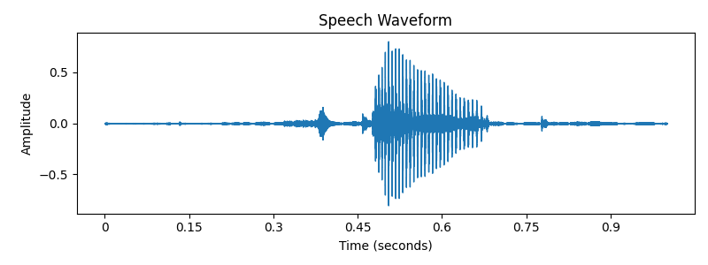
- X-axis: Time (seconds)
- Y-axis: Amplitude
- Peaks/troughs reveal syllables, pauses, and prosody patterns
Key Takeaways
- Speech data is just numbers—sampled amplitudes at rate \(f_s\)—but it encodes rich linguistic and acoustic cues.
- Use the waveform for timing/loudness cues; use the spectrogram for phonetic and timbral information.
librosa+matplotlibprovide a fast path from audio file to insight.
Conclusion
You now have a compact workflow to load, inspect, and visualize speech with Python.
Start with the waveform for a high-level sanity check, then move to spectrograms and features (e.g., MFCCs) for modeling.
From here, you can branch into keyword spotting, ASR, speaker ID, and emotion recognition.
Happy experimenting!
Video
Reach PostNetwork Academy
- Website: www.postnetwork.co
- YouTube: www.youtube.com/@postnetworkacademy
- Facebook: www.facebook.com/postnetworkacademy
- LinkedIn: www.linkedin.com/company/postnetworkacademy
- GitHub: www.github.com/postnetworkacademy